Giftly
Mobile-first virtual gift card
Giftly is a virtual gift card company that was looking to improve the conversion of their eGifts.
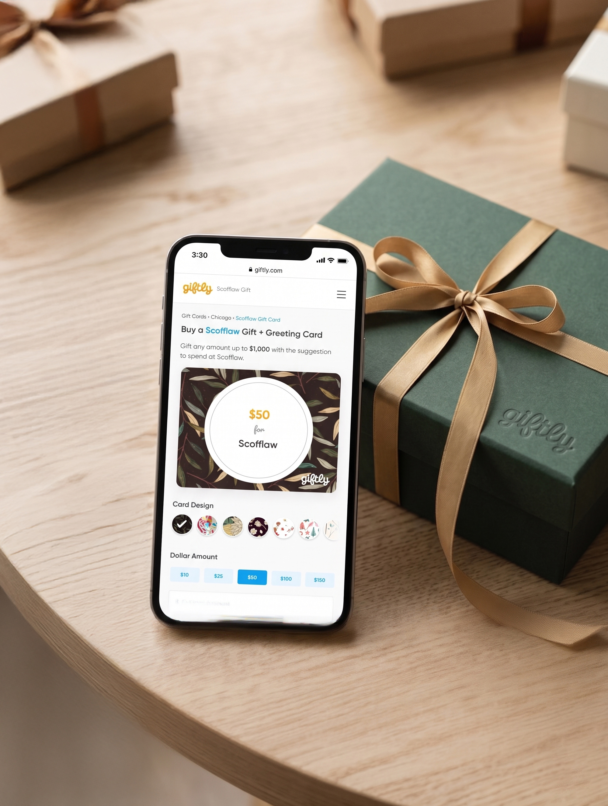
Unlike traditional gift cards, Giftly offers a flexible eGift that can be used at any merchant, not just one preselected by the sender. Because many of their visitors arrived on their site through a Google search, these visitors didn't know how Giftly was not only different but better than traditional gift cards.
Telling this product story in a simple way that was both mobile-friendly and frictionless in its checkout experience were the main challenges of the project.
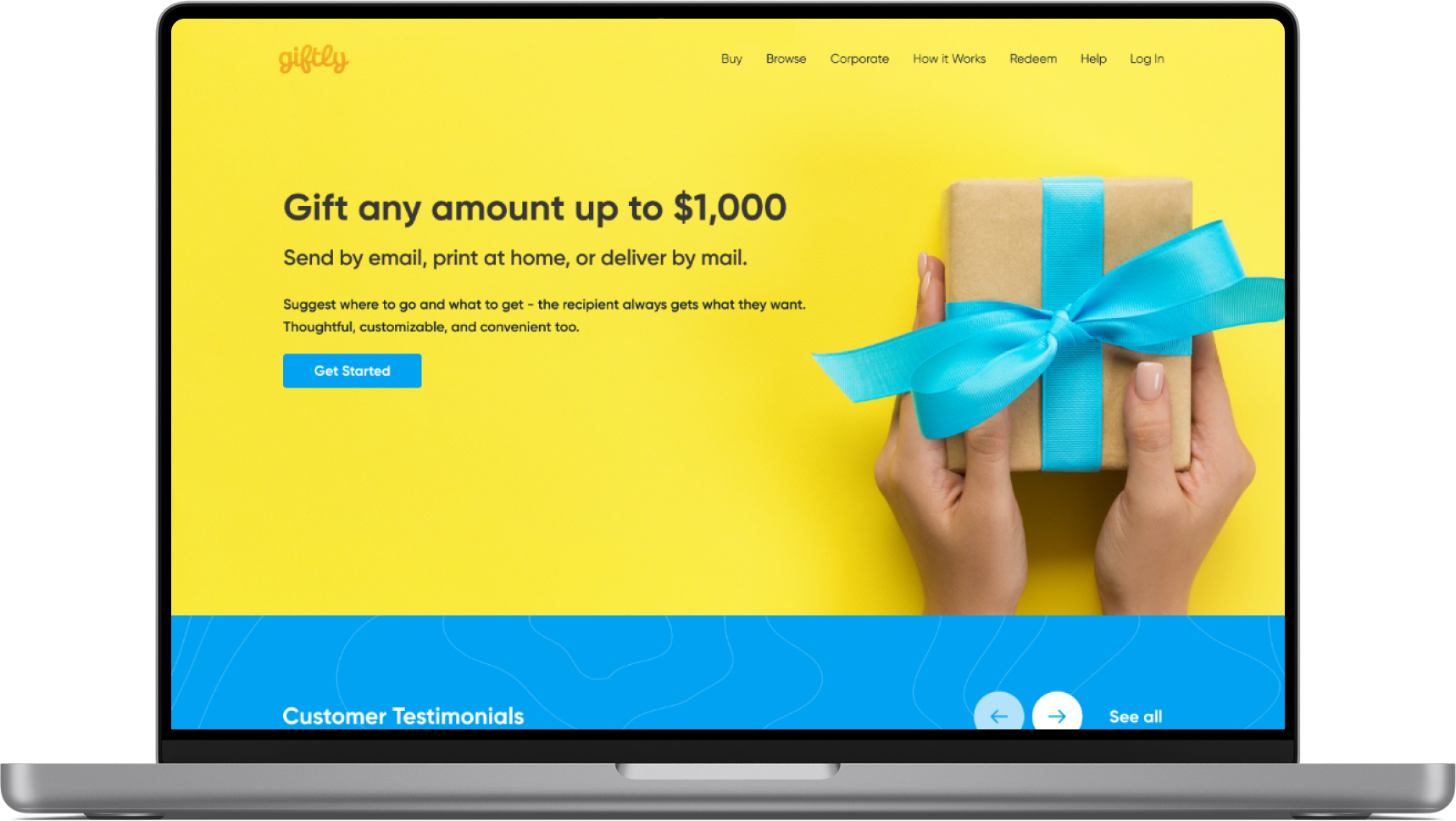
Working with the product team, we identified the following key goals:
Modernize look and feel of the consumer experience
Optimize the experience for mobile (65% of traffic is mobile)
Increase the number of customers getting to checkout (from 10%)
Reduce mobile bounces on checkout (48%)
Reduce exits during delivery & card selection (50%)
Reduce payment errors & retries
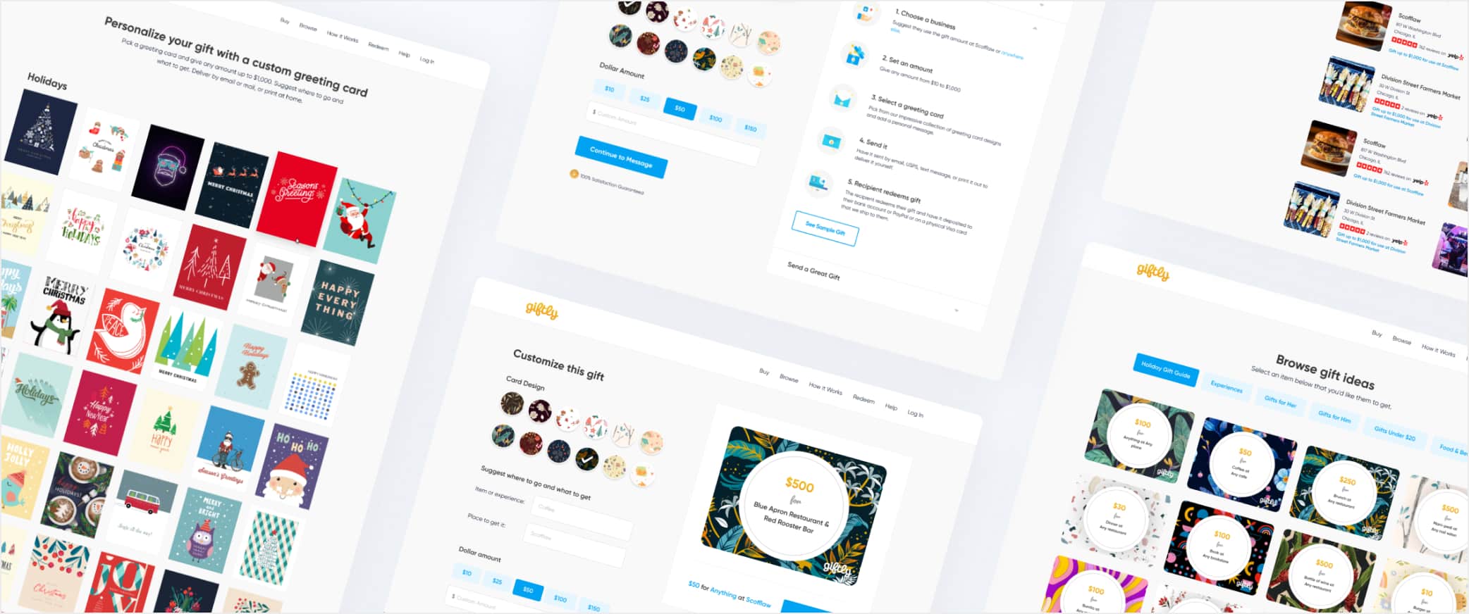
A gift card,
not a generic icon.
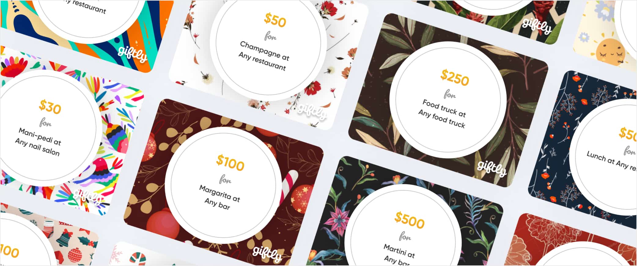
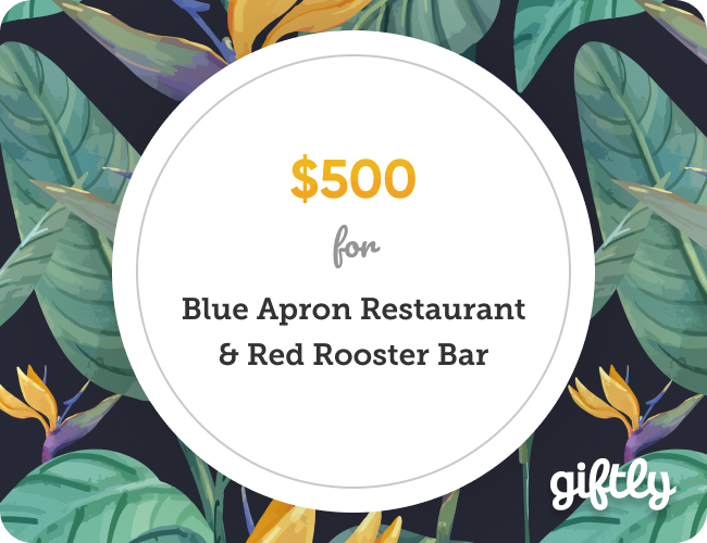
Redesigned the core shape around a physical gift card.
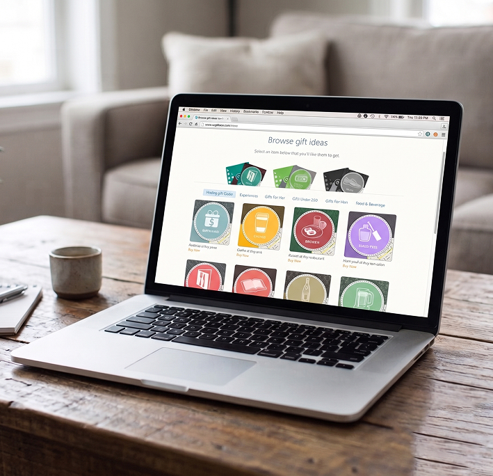
Swapped the square icon grid for a card-shaped format, closer to what someone actually holds when they receive a gift in person. The shape alone did more to connect the product to sentimentality than any copy could.
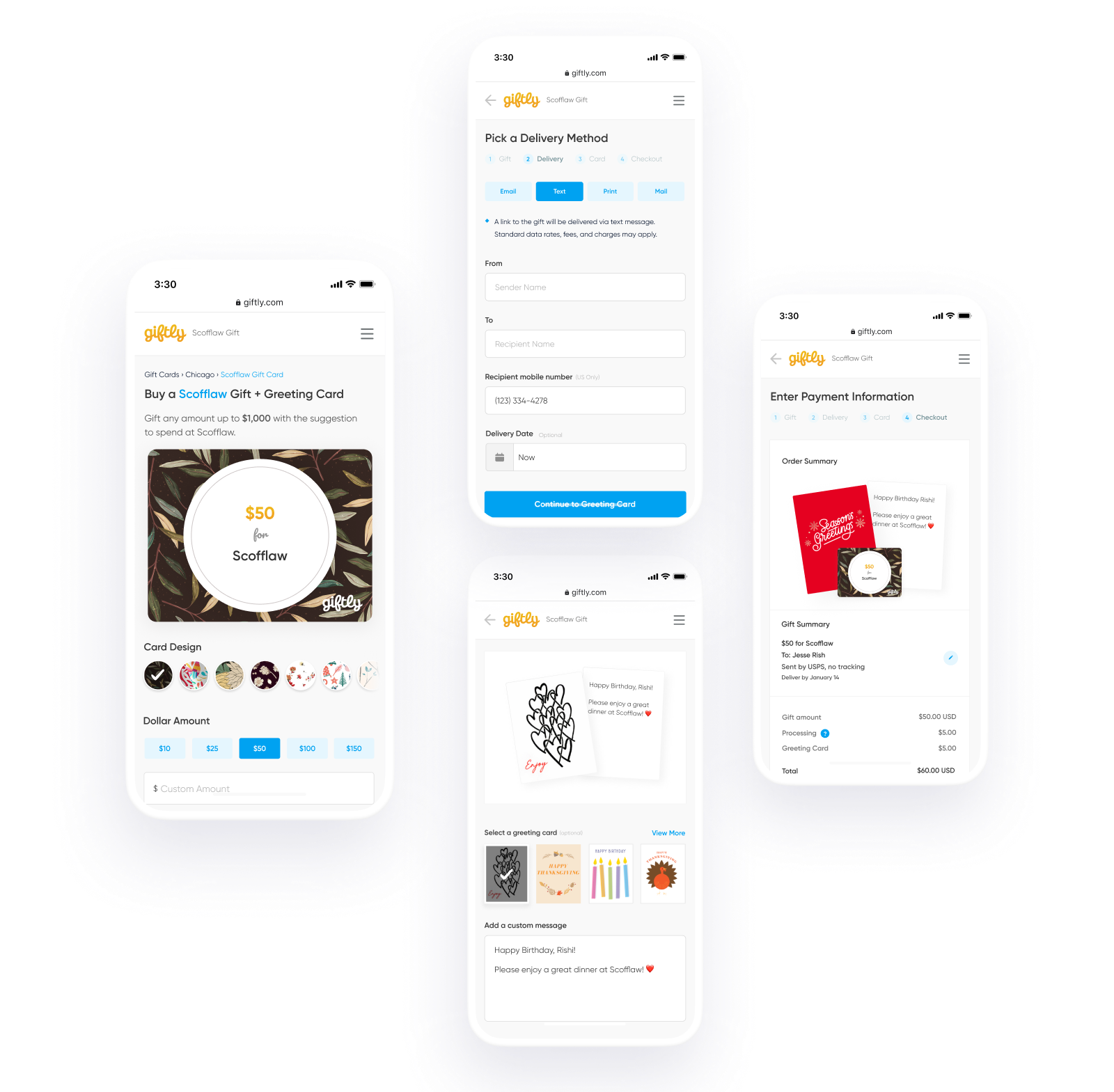
Added a custom card choice to checkout, even though it's virtual.
The card itself has no physical form, but letting the sender choose a design still signals thought. A small step, but it moved the experience from "sending money" to "picking something out." As the sender personalizes their card, they watch it come together with animation and message text appearing as if it's being handwritten in the moment. The gift starts to feel made, not generated.
Designed a matching opening animation for the recipient.
The thoughtfulness built into sending the gift carries through to receiving it. A short animation upon opening the gift card adds an added moment of surprise and delight.
Extended the same card shape to a printable format.
Not every gift is handed over on a screen. The printable version folds like an actual greeting card, complete with a redeem code and QR code on the inside, so the experience still holds up when it's given in person.
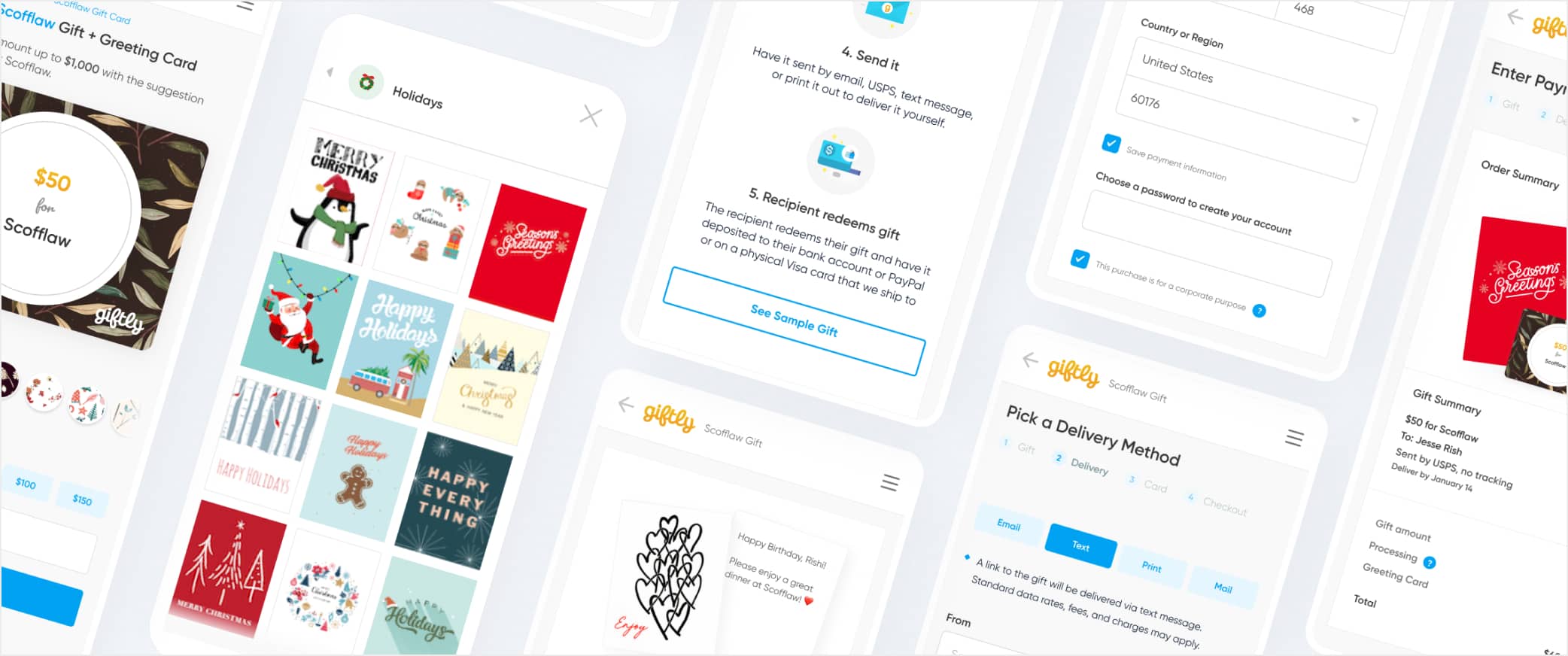
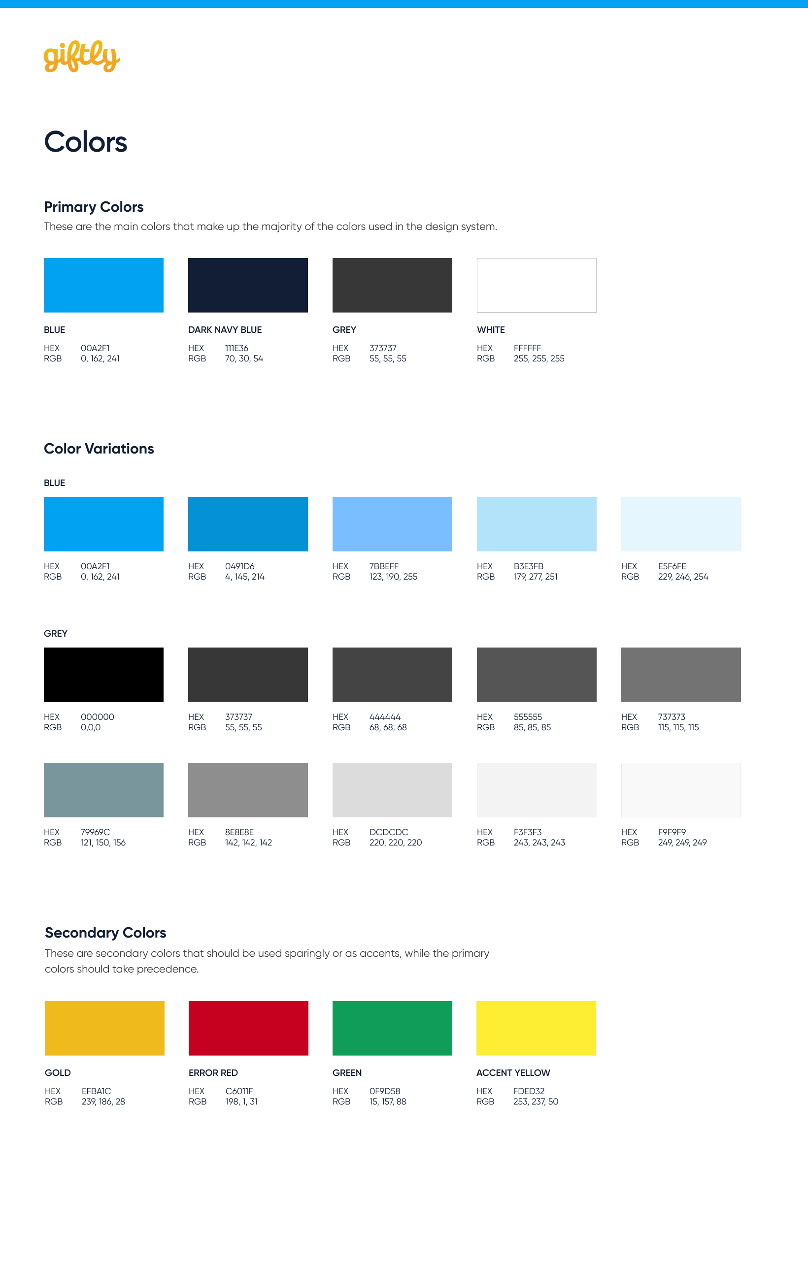
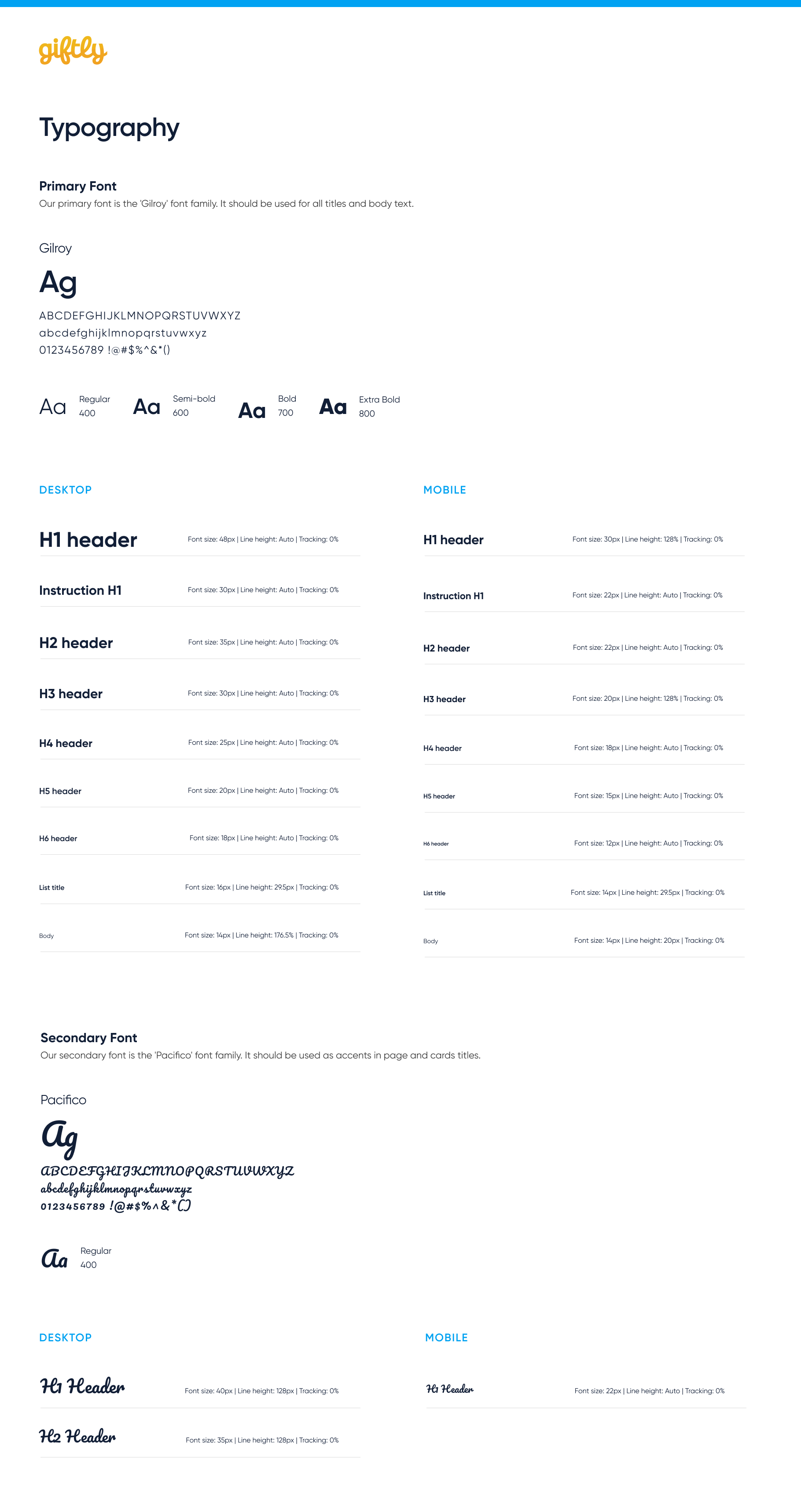
New brand guidelines for color and typography carried the redesign's visual language across every touchpoint, from the homepage down to a single checkout step.
Next case —
Empowering independent pizzerias
Bringing modern ordering technology to independent pizzerias everywhere